Role: Solo Product Designer
Role: Solo Product Designer;
Role: Solo Product Designer;
Duration: 4 weeks
Duration: 4 weeks
Overview
Overview
Sottovoce DSP is a modern software company that produces digital audio plugins. My services were required to design the logo along with branding assets, and plugin's all-around UI & UX.
Let’s dive into the highlights of the UI & UX journey.
Sottovoce DSP is a modern software company that produces digital audio plugins. My services were required to design the logo along with branding assets, and plugin's all-around UI & UX.
Let’s dive into the highlights of the UI & UX journey.
Process
Process

The main goal was
getting rid of clutter
The main goal was
getting rid of clutter
“
“
”
”
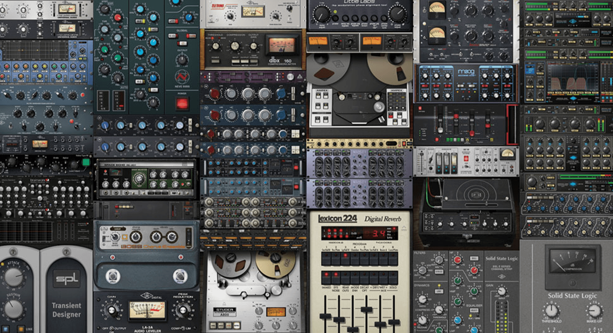
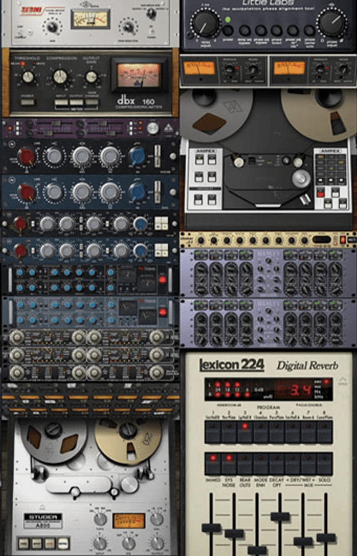
Many existing plugins feel uninviting and intimidating. Making the software accessible and user-friendly would intrigue music enthusiasts and welcome new users who aren’t as savvy.
Many existing plugins feel uninviting and intimidating. Making the software accessible and user-friendly would intrigue music enthusiasts and welcome new users who aren’t as savvy.
After client consultation and secondary research, three clear UI goals emerged:
After client consultation and secondary research, three clear UI goals emerged:
1
1
1
Minimalist design BUT not boring.
Minimalist design BUT not boring.
2
2
2
No knobs, high contrast, pleasant colour palette.
No knobs, high contrast, pleasant colour palette.
3
3
3
In-your-face title text for easier marketing.
In-your-face title text for easier marketing.
Competitive Analysis
Competitive Analysis
modern
user friendly
clear
modern
user friendly
clear
Client-Provided Materials
Client-Provided Materials
The UI Mock-Up
Styling Inspiration


The Breakdown
The Breakdown
Step 1: Take what works and remove what doesn't.
Step 1: Take what works and remove what doesn't.
Although this design avoids the clutter of old-school plugins, it still feels busy and uninspired. Let’s improve it.
Although this design avoids the clutter of old-school plugins, it still feels busy and uninspired. Let’s improve it.
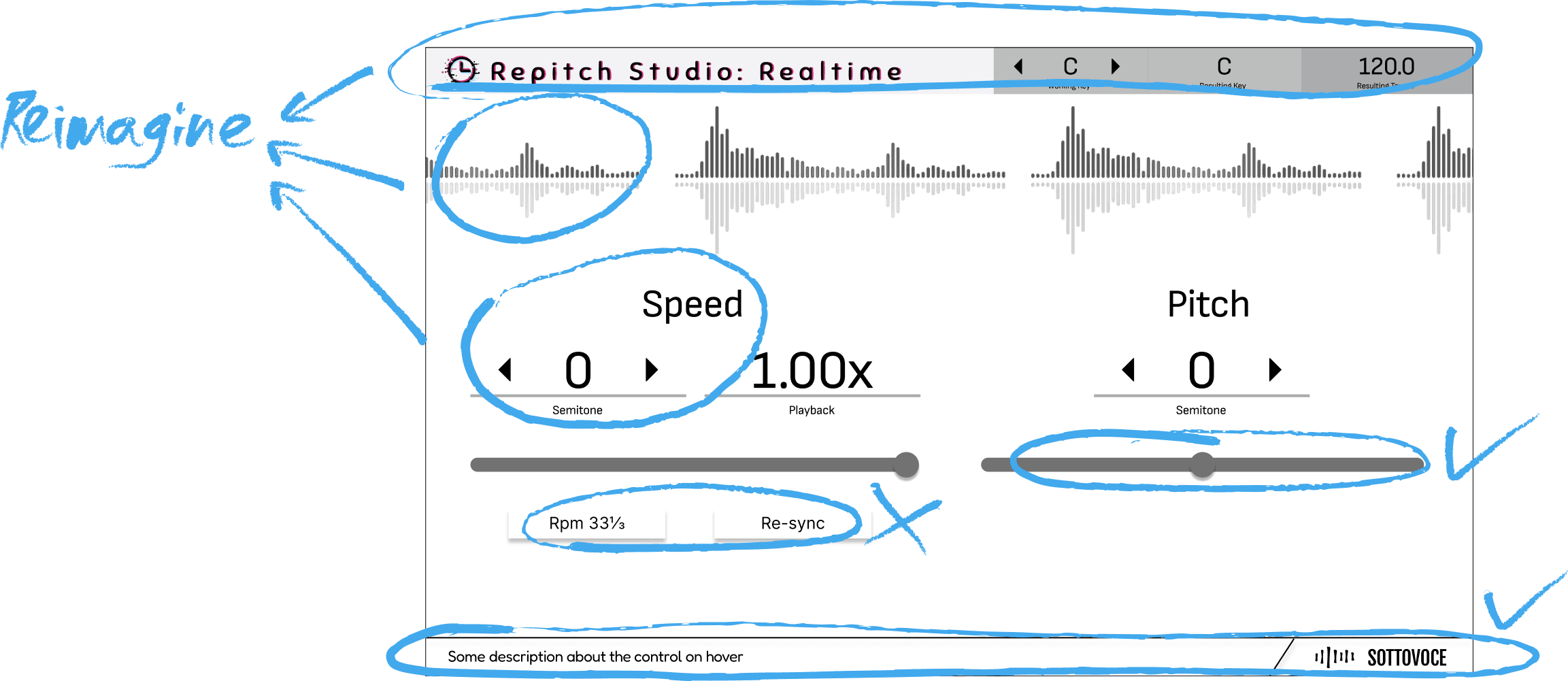
Step 2: Reimagine
Step 2: Reimagine
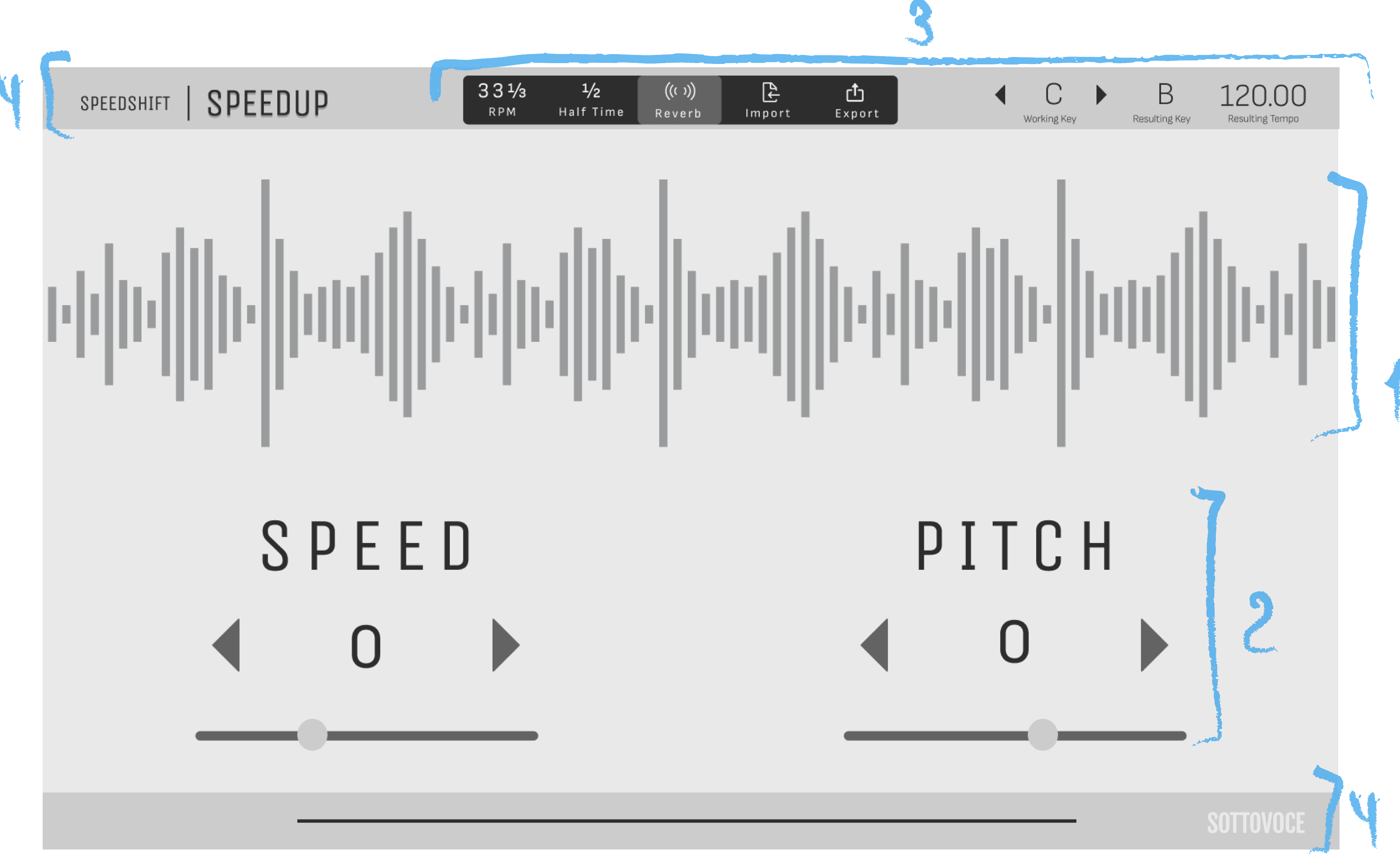
1
From previously demure waveform, it now becomes the focal point to bring in visual diversity.
From previously demure waveform, it now becomes the focal point to bring in visual diversity.
2
An actionable component template, instead of various components with distinct layouts to minimize cognitive load.
An actionable component template, instead of various components with distinct layouts to minimize cognitive load.
3
Any actionable elements that don’t fit in the “fixed” component template go up in the header to keep them in one place.
Visible & straightforward.
Any actionable elements that don’t fit in the “fixed” component template go up in the header to keep them in one place.
Visible & straightforward.
4
4
4
Subtle but clear branding in the header & footer.
Subtle but clear branding in the header & footer.
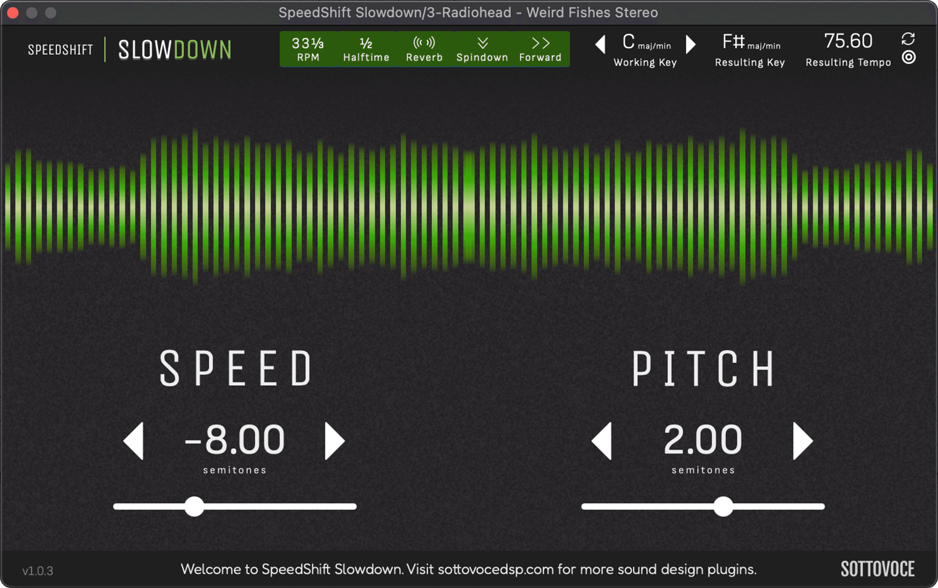
Step 3: Stylize
Step 3: Stylize
Our style formula will include these 3 concepts:
Our style formula will include these 3 concepts:
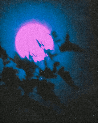
Accent Colour

Noise Texture
High Contrast
Typography
Typography
Primary Heading
Unica One / CAPITALIZED
Capitalized, sans-serif, narrow letter spacing reinforces clean, modern, technical, audio-focused tone
Labels, Body
Sofia Sans / Regular
Continuing with sans-serif for clarity and modern feel. Spaced comfortably for readability.Rounded lines create a sense of precision and fluidity
Continuing with sans-serif for clarity and modern feel. Spaced comfortably for readability. Rounded lines create a sense of precision and fluidity
Footer
Fredoka / Regular
Used in the footer for an unobtrusive message to the user. A different font was needed within the footer to create a mental separation from the plugin interface itself.
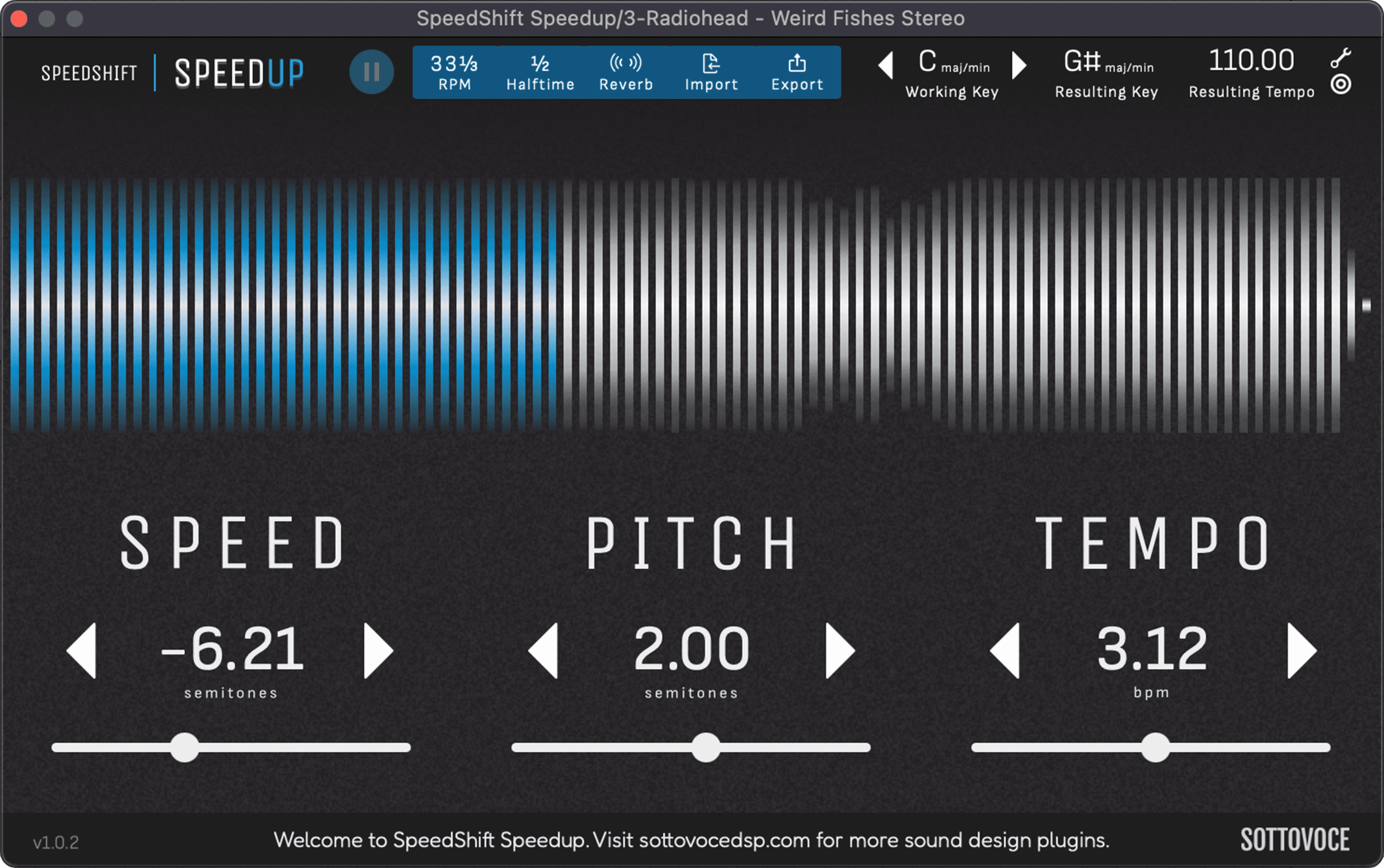
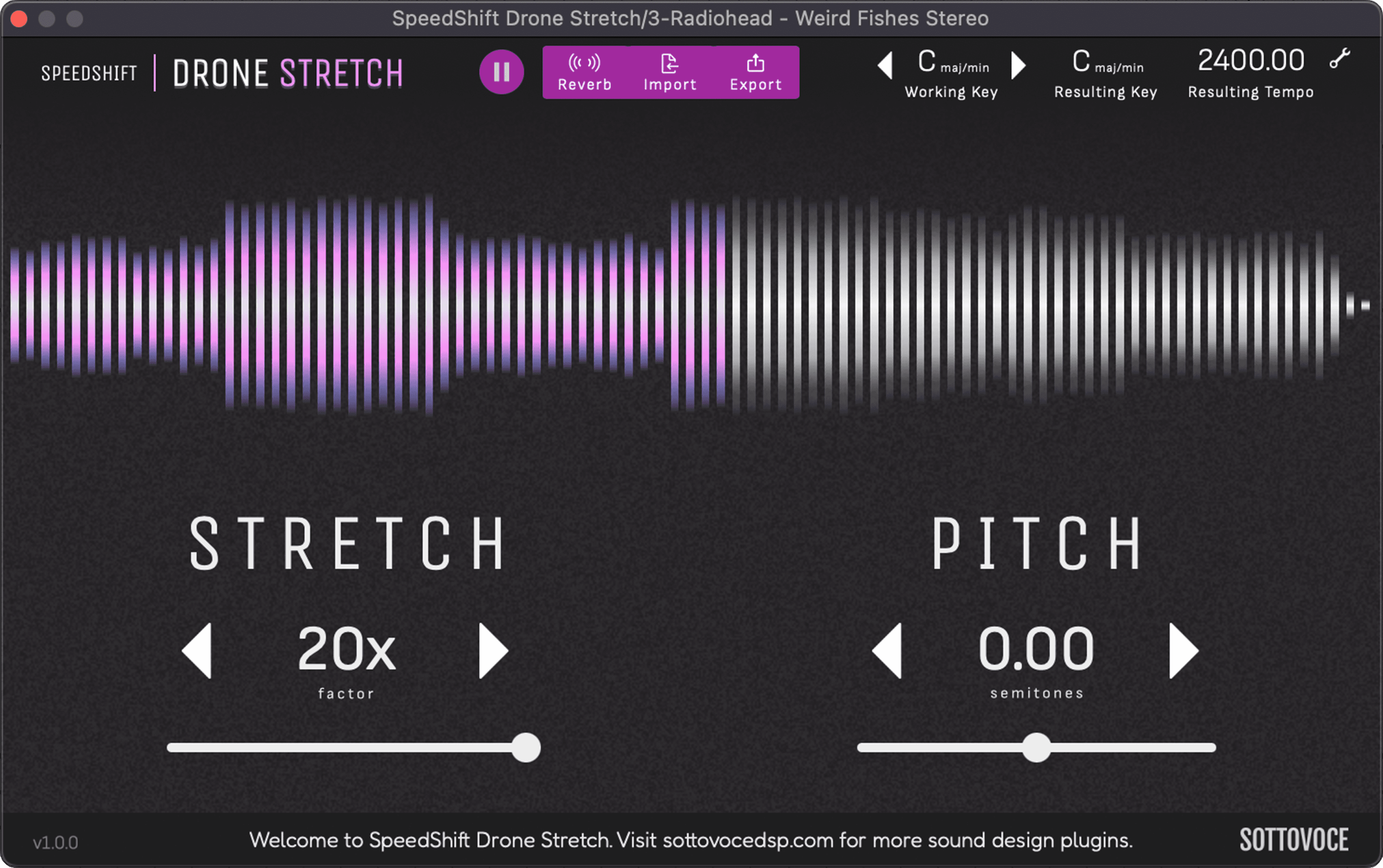
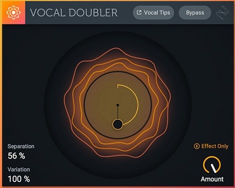
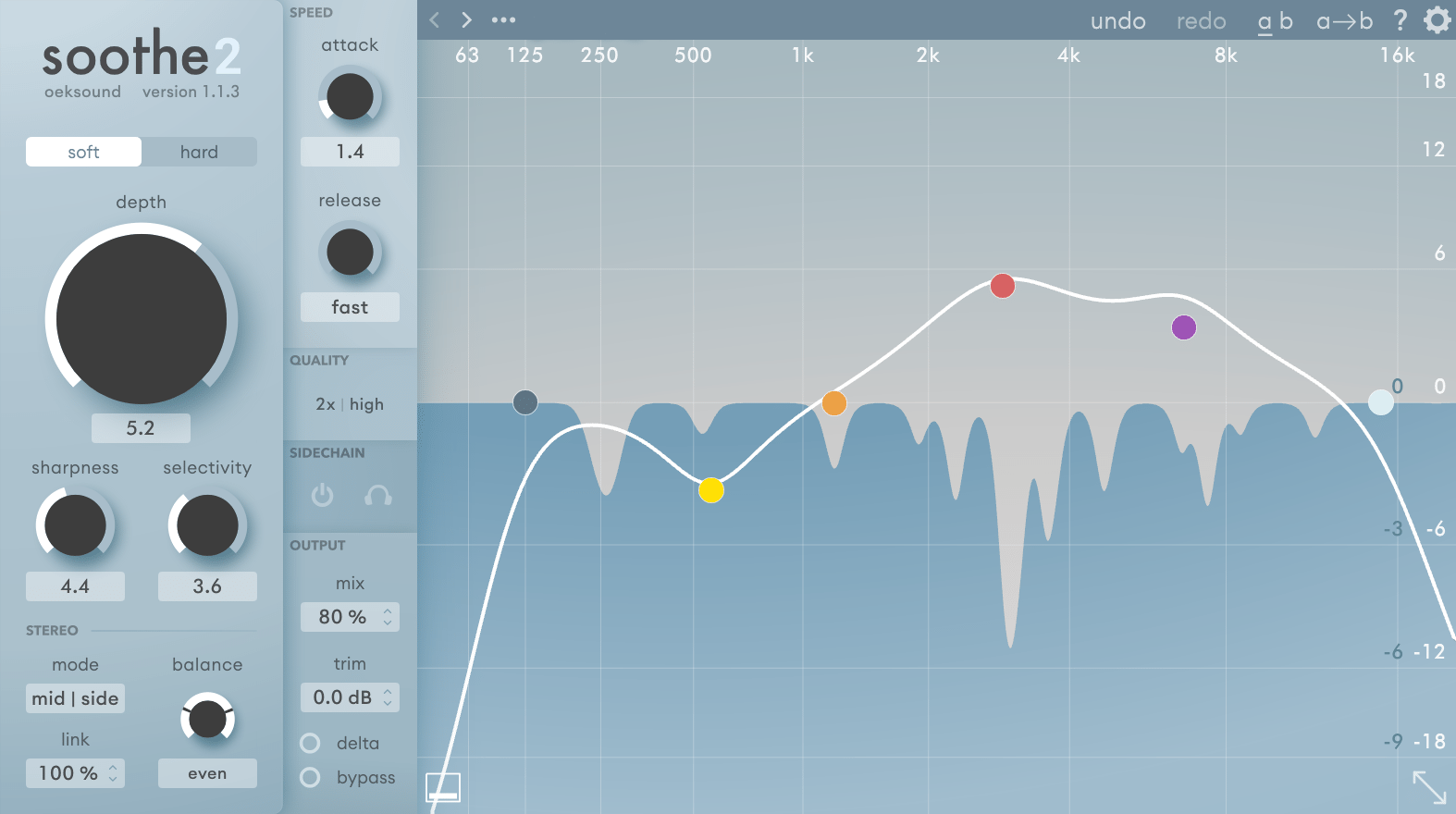
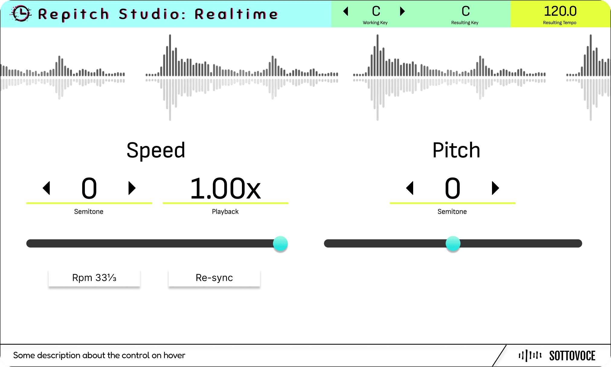
Finally
Finally
By following brand guidelines and applying a focused stylization system, the final product is both polished and recognizable in a competitive market.
By following brand guidelines and applying a focused stylization system, the final product is both polished and recognizable in a competitive market.
The Cherry On Top!
The Cherry On Top!
Structuring reusable components within a clear visual system made future product development more efficient.
Structuring reusable components within a clear visual system made future product development more efficient.
Since the first audio plugin was completed, two more have been built using the same framework — and more are on the way.
Since the first audio plugin was completed, two more have been built using the same framework — and more are on the way.
za.valeriia@gmail.com
za.valeriia@gmail.com
See Resume